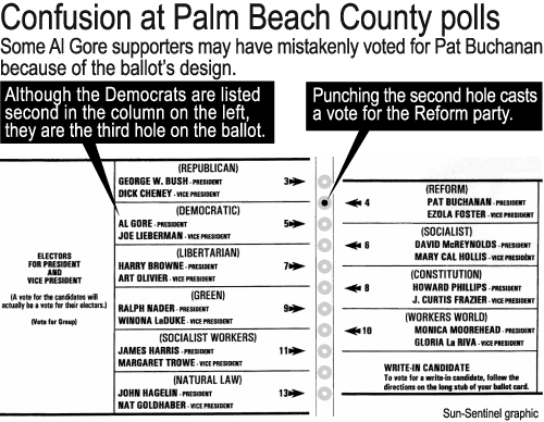
Shown below is a widely circulated image of the Palm Beach County ballot that I believe was originally published by the South Florida Sun-Sentinel.
I find the most confusing aspect of the above design to be the horizontal line above the word (DEMOCRATIC). I found my eye being led directly to the second hole -- the one for Buchanan.
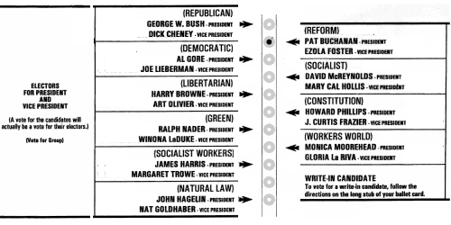
A very small amount of redesign results in the graphic shown below. Now, the arrows instead of the horizontal rules are the most prominent feature, and they lead directly to the appropriate hole to punch.
I have limited my changes to those that required moving graphic elements that already existed. I did not attempt to set the type in a larger size, nor use lowercase as well as uppercase to improve legibility. It's still not ideal, but if a "Butterfly Ballot" of this type is necessary for some reason, I believe the redesign below is better than the original.
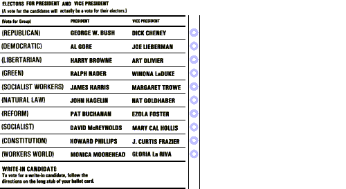
After my first attempt, I decided to see whether it would be possible to rearrange the elements of the graphic onto a single column. Interestingly, it was not only possible, but the result is actually narrower than the first column of the original.
The Washington Post has an actual photo of the ballot. The photo makes clear an additional confusing factor, namely that the ballot must be positioned by hand beneath a plastic template with guide holes. In this situation, I think the arrows on the page could easily be construed as guides to help align the page horizontally beneath the template. After serving this purpose, they might then be lost in the visual clutter in the middle of the page. A reasonable strategy for using the ballot would then be to count downwards in the left column until reaching the desired candidate, and then count downwards from the top of the template, punching the corresponding hole.
Although I think my first redesign -- the one with the candidates listed in two columns -- is clearer than the original, it still suffers from the problem where the arrows could be interpreted as markers to help align the page horizontally. The second redesign with the candidates listed in a single column eliminates the arrows and puts the holes in the same order as the candidates. Much clearer.
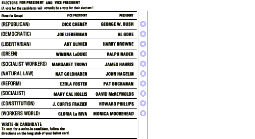
I received e-mail suggesting an additional refinement to the single-column format. In the graphic below, the names of the candidates for president are right-justified next to the hole to be punched.
The books of Edward Tufte, including The Visual Display of Quantitative Information, Envisioning Information, and Visual Explanations: Images and Quantities, Evidence and Narrative, deal with issues like this one in much greater detail. The book The Non-Designer's Design Book by Robin Williams (the author, not the comedian) has some useful advice about proximity, alignment, repetition and contrast.